
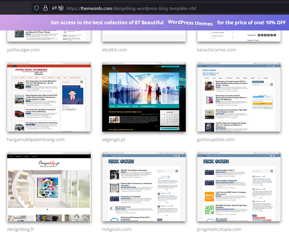
 I had to update my website today. I’m definitely a function over form person, and I don’t care much for frontend development. I thought the old design was fine, but I was running an abandoned theme that was no longer being updated. While I was looking around to see if anyone still supported my old theme, I came across this site which showed what must be some of the few remaining sites using it. 2 of their 12 sample sites were me – not a good sign!
 Why did I have to upgrade?
I run my own webserver in AWS where I host a handful of other sites. I was tired of maintaining multiple versions of PHP on that server, so I decided to get all the sites running version 8+. My theme was so incompatible with PHP version 8+, that I decided it would be faster to change themes than it would be to update my old one. One example from my old theme is that it used curly braces to access array elements, like this: $array{1} instead of the more common $array[1]. I feel like I haven’t seen anyone do that in a long time, so this theme was old indeed!
My design process
I really didn’t have the time to do a full re-design. I also didn’t have the interest. My process was to look for the simplest themes I could find, install them all, and then see which one looked the least messed up when I applied it without any further customization. I probably tried about a dozen themes before I came across one called Kent. It worked out of the box! In fact, the site that you are looking at now has almost zero modifications to the base theme. This is all I did, all via the built in WordPress theme file editor:
- Found an open clipart wallpaper to use as a side image
- Replaced the text header logo image with one made via the Gimp logo generator.
Whats Next?
There are some things I don’t like about this theme. I’d like to have a sidebar to show recent comments, tweets, a tag cloud, and other content. This theme doesn’t really have any useful block locations. I may add some block locations or switch to a similar theme that includes more placement options. At the same time, I don’t enjoy doing that stuff, and this blog is just a hobby. Its not my favorite hobby right now, so it may just stay like this for another 5 years.
Thanks for dropping by. Let me know what you think of the new design below!
The site looks great. Simple enough to browse and find some interesting content. It’s more focused on vertical which is certainly the trend. Nice work!
[…] been almost 3 years since I updated the theme on this website. You can see the article about that here. At the time, I didn’t want to spend any time on it at all, so I just found the quickest […]